Tuesday, 7 January 2014

First Draft For Magazine Article


This is my first draft for my music magazine double page spread article and overall I am very pleased with it. I did my article about a young teenager who became a big artists just over the internet by posting youtube videos, and how she progressed to be what she is now with her single "Fly With Me" at number 6 in the charts. I feel that this is a beneficial article for my target audience as most of my target audience are aged 16-24, at this age someone might be in the same situation Paige was in, this way it is giving them advice as well as telling them about Paige's intriguing story. I have also kept a consistency throughout this magazine on my front cover, contents page and now double page spread article, this is by using the same font for the masthead. The house style keeps it looking professional and sophisticated yet on the other hand, original. I have also used one whole side of the double page spread for the image, I did this because looking back at the feedback I got from my target audience in previous questionnaires, they specifically said that images draw a lot of attention and catch the readers eye as without them it would look boring. However, what my magazine article does lack is colour. In previous questionnaires a lot of the feedback mentioned the use of colour and how it livens it up. Therefore, colour will be one of the parts I change and focus on to improve and produce the best possible magazine double page spread article for my target audience. Secondly, I have also included a quote from the article which overlaps the image on the left. The quote reads 'I got signed with EMI record label within that week'. This quote is a very intriguing and interesting quote which should engage the reader. Lastly, I have also included the 'ir' at the bottom right hand corner, the 'ir' stand for indie rock. Indie rock is the masthead of the music magazine and by having the letters 'ir' repeated on every page whether it's small or big, it reminds the reader what magazine they are reading, it will also help for in the future as seeing the masthead over and over again will help my target audience remember it.

I have also compared my double page spread article to an article from the music magazine Q.  Overall, they are both very similar as in the image filling the whole of the left page. On the other hand, the three columns of text in the article make and help it look more professional, this is one of the things in which my magazine article is lacking at the moment; professionalism. 
Also, the Q magazine has made a use of colour, to do this they have overlapped a big letter 'L' which stands for Lady GaGa. The 'L' is in a bright red font which helps it stand out and look very alerting. The 'L' is also in a serif font, this font helps the magazine article look professional yet sophisticated as well. 


Questionnaire:

I created a questionnaire to ask three people from my target audience two simple questions; what is good about it? and what would you change/improve? The feedback I get will help me improve on my next draft by changing specific parts to fulfil my target audiences needs.


Shannon:

1. What do you like about it? I like how it is very plain which helps it look professional and suit the genre.

2. What would you improve/change? Although it looks good plain I still feel that there should be a little bit of colour, whether it's the quote or the masthead.


Nathalie:

1. What do you like about it? I like how the image takes up half of the magazine article as when i'm looking through magazines, images always stand out to me.

2. What would you improve/change? I would add more on to the article as at the moment it looks very plain and boring.


Paige:

1. What do you like about it? I like how you've kept the font consistent throughout the front cover, contents page and magazine article as this helps it look professional and real. I also like the article, it's about a young girl which is very inspirational for young teens out there.

2. What would you improve/change? I would also add a bit more colour to it, maybe a red or orange to go with the orange colour in the edit on the image. 

Sunday, 5 January 2014

Final Draft For Front Cover

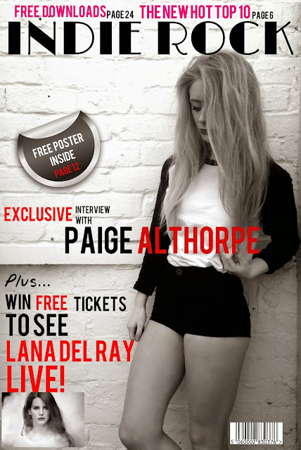
This is my final draft for my front cover. Not much has changed from my second draft as I feel that I have produced the best possible magazine front cover I can now. I have listened to my target audience and have included what they asked for, for instance, more images and the use of colour on specific text. Firstly, the parts I have changed are the positioning of the sticker, before hand it was quite low down which revealed a lot of free, blank space under the masthead, this in which made it look slightly plain and boring. However, after listening to my target audience I have moved it up slightly to cover that blank space so it now looks more professional. Secondly, the other part my target audience complained about was the text above the masthead. Before the text was in a big, hot pink font, my target audience said that the big, pink font almost taken away the attention given to the masthead. To solve this problem I have used a blue font as it is a much calmer colour unlike hot pink. I also have adjusted the size a little to make it smaller to prevent this problem from happening again. The reason why I chose a blue colour is because it connotes very calm things such as the sky, and the sea, however, this is very ironic since some indie rock songs are opposite to this calm feeling for example the song Somebody Told Me by The Killers. I have also kept the use of the red font the same as it was in my previous magazine front cover draft. This is because the questionnaire I made for my target audience gave positive feedback back regarding the red font and how it is very alerting and eye catching, so therefore, I kept it the same. 

Second Draft For Contents Page

This is my second draft for my contents page and again like my front cover I feel that I have massively improved. Firstly, I have changed the masthead by adding a red background. The red background attracts the reader as the colour red is very alerting and eye catching, hence why my colour scheme is black, white and red. I have also included the letter 'ir' next to the masthead. 'ir' is written in a big, black, bold font and also stands for indie rock which is the masthead of the magazine, this is here simply to remind the reader what genre the magazine is and what magazine they are reading to hopefully then help them remember it for the future. Secondly, I have taken my target audiences advice and decided to have the image separated from the rest of the text. This is so we know that the image goes with the caption 'find out how paige made it to the top 10 so quickly! find out her secret'. The use of the image is to engage the reader, whereas, if it was just the caption with no image it would look boring and the reader are bound to just turn over the page and not read it. Lastly, The numbers of the pages are in a big font which is the same font as the masthead on both the front cover and the contents page, this is to keep a consistency throughout. 


Questionnaire:

I created a questionnaire to get feedback from my target audience that would help me improve and/or change something on my contents page to produce the best possible magazine contents page for my target market. To do this I will also try and include everything they want for example, the use of different, bright colours and images. I asked three people from my target audience two questions; what do you like about it? and what would you change/improve?


Nathalie:

1. What do you like about it? I like how you have used red lines to separate different sections, now it is easier to see what text the image goes with.

2. What would you change/improve? It still looks a bit plain, maybe add more information on it and more images.


Leanne:


1. What do you like about it? I like how you have put a thick red box at the top with the title written in it, this really helps it to stand out and engage whoever is reading it.

2. What would you change/improve? I would also add more text to make it look more busier. 


Michael:


1. What do you like about it? I like the use of the black, white and red as it links with your front cover, this also helps you keep a consistency throughout.

2. What would you change/improve? I would add more images, as seen in other music magazines on the contents page they have more than one photo. 

Second Draft For Front Cover

This is my second draft for my front cover, I feel that this is a massive improvement from my original draft. Firstly, I kept the masthead the same due to that being the first thing people look at so I need to make sure it is definitely going to engage them. Secondly, I made a lot of changes but not in what I wrote, but how and where I have put them. For instance, where it says 'free poster inside', is now inside a sticker to separate it from the other texts. I simply found the black sticker on google images and then opened up as a new image, shrunk it down and placed it on the left. The point of the sticker is so it contains significant information for the reader to easily see and read. On the other hand, I also put 'Paige Althorpe' written across her body. This is to let the reader know who she is and what the magazine consists of. I also made a use of the colour red to put emphasis on certain words. When I carried out that questionnaire regarding what to add to the front cover, contents page and double page spread, I had gotten feedback back saying if I was to use a certain colour for more emphasis on specific words or text, make it red. Red is a very alerting colour and connotes a variety of different feelings. Unlike in my first draft when I used blue, blue is a very calm and relaxing colour which would not make my target audience feel very alerted and notified by the front cover. However, I have only written certain words in red for example when it says 'win free tickets to see Lana Del Ray live' I put 'free', 'Lana Del Ray' and 'live' in a red font to highlight important words. Another example of the use of colour is the pink text at the top above the masthead. I decided to use hot pink as it separates it from the significant parts of text on the main image below the masthead. However, the use of pink quickly draws the readers attention to the 'new hot top 10' and 'free downloads', whether or not my target audience are interested, it is there; hard to miss and easy to read. lastly, I have again taken the target audiences advice and have added another image to liven up my front cover. They advised me to add more images to my front cover to make it more engaging and less boring.


Questionnaire:

I also made a questionnaire for my second draft in order to find out what I need to improve on and what I should keep the same. I asked two simple questions; what's good about it? and how should I improve? I also asked three people from my target market of all ages ranging from 16-40 in order to get different feedback from people different ages. As I will be making my final draft next for my front cover, I want to make sure the style and look is fulfilling my target audiences needs.

Nathalie:

1. What do you like about it? I like how it's set out, it is definitely an improvement from the first draft, also the extra image allows more

2. What would you improve/change? Maybe add something under the title as it seems to be a bit bare in that area. Unless you move the sticker up a bit.


Leanne:

1. What do you like about it? I like the way you have overlapped the image with important text, it really engages me, especially the use of the red font.

2. What would you improve/change? I would change the size of the text above the title as to me it takes away the focus of the title itself.


Lorraine:

1. What do you like about it? I like the way it is all set out and the choice of colour and size of font on specific words makes it look really professional.

2. What would you improve/change? However, I would also make the writing above the title smaller because at the moment it is taking all the attention off the title, and the title is important as it tells you what genre of music it is about.

First Draft For Contents Page

This is my first draft for my contents page that I produced on pixlr. Firstly. I chose this image as I like the effect I made on it, it's a sparkle effect which adds to it being unusual and individual like the music genre I have chosen; indie rock. The image is again very simple like the image I have chosen to use on the front cover. I kept the masthead in the same font and the rest of the information in the same font as the other text on the front cover also. This is to keep the house style consistent throughout so therefore, I will be using the same fonts on the double page spread article. I used a black font for the masthead as black is a very bold colour which will catch the readers eye, this will help them easily know what page they're on without searching for it, therefore, preventing difficulties for my target audience. However, on the other hand, I used a red font for the short snippets of information telling the reader what is on each page. I chose red because it is a very alerting colour hat connotes a variety of different feelings. Also looking at other music magazines, red seems to be a popular choice, for instance, Q use red a lot. I also included awareness of freebies on the contents page. This is written in a contrasting white colour font which is also slightly bigger than the rest. I did this due to a lot of people like getting free things such as posters of their favourite band or artists. I have also put the free poster on a page which is quite further back, this is because, to find the poster the reader will have to search for 'page 12' then will become engaged within appealing and interesting articles along the way.
I have compared my contents page to one of Q's contents pages. As you can see the main colour used is red so is obviously an eye catching colour. The difference is is that they have not used the image as the whole background, so I will place the picture on the page and leave white space to write, this will also prevent the text overlapping the image. The overlapping of the text over the main image will also cause troubles for the reader to read so I and the magazine will benefit form having blank space at the side of the main image. Also the bid, bold numbers on the images tell the reader what page to go to for that certain article. The number are also in different colours depending on the background, for instance if the backgrounds white the font is in black, and if the backgrounds black the font is white. Lastly there is also a red box going across the top which has the masthead write inside. The red box allows them to use a contrasting colour, in this case a black font, this all adds up to it gaining the readers attention which is very beneficial. 


Questionnaire:

I created a questionnaire consisting of two simple questions asking what they liked about it and what they would improve. I asked three people of all ages from my target audience in order to receive feedback that will help me improve.

Nathalie:

1. What did you like about it? I like the edit on the image as it is very unusual and I have never seen anything like that in a magazine before. 

2. What would you improve? To improve I would perhaps use a white background like in the Q magazine contents page, this would help reading the text.


Lorraine:

1. What did you like about it? I like the use of different colours

2. What would you improve? Maybe use more contrasting colours like pink to liven it up.


Leanne:

1. What did you like about it? I like how you have arranged it with the numbers in a bigger font to make them stand out more.

2. What would you improve? It's a bit confusing to see what section the image goes with I would make it clearer that it's meant to be with the 'exclusive interview' section.

Questionnaire

I have created a questionnaire to ask 2 people from my target audience both different ages what they would like to see on my music magazine. By doing this It will help me create the best possible music magazine front cover, contents page and double page spread that will fulfil my target audiences needs.


Nathalie Wright:

1. Would you like to see a lot of significant information filling the front cover or would it help if it was more relaxed and not so much in-your-face? Obviously the magazine front cover should have lots of eye catching and interesting information on the front cover, however I don't think you should fill a lot of the space as that might make it hard for people to read and be engaged. 

2. What sort of information would you like to see on the front cover (images, awareness about concerts and gigs...) On the front cover I definitely think you should include other images, perhaps one or two as this will give the us an idea of what to expect within the magazine. Also giving us awareness about free posters and tour dates inside are very engaging. 

3. Other than white and black, what colours would you want to see on the front cover, contents page and double page spread article to feel more alerted about the information? I personally think that red is a good choice as it will contrast well with the white and black and is a very alerting, powerful colour that connotes many different feelings such as love and danger. 

4. Overall, what are they key things that draw your attention to significant information? The colour and the size of the text is very important, also images really draw my attention to that specific section. 


Leanne Payne:

1. Would you like to see a lot of significant information filling the front cover or would it help if it was more relaxed and not so much in-your-face? I think for your music genre, indie rock, it would help if it want too busy but had enough interesting information on it to prevent it being and looking boring. 

2. What sort of information would you like to see on the front cover (images, awareness about concerts and gigs...) On the front cover I would like to see sections alerting the reader about competitions about winning tickets and interesting snippets about popular celebrities like Lana Del Ray.

3. Other than white and black, what colours would you want to see on the front cover, contents page and double page spread article to feel more alerted about the information? Again, I think red and pinks are very popular colours used on magazines, but avoiding this repetition you could perhaps try a bright blue, as blue is a very calm and relaxing colour, or maybe combine the two colours...

4. Overall, what are they key things that draw your attention to significant information? Images really help me feel engaged, if I see a photo of something or someone interesting I will end up reading about it which would benefit you a lot.


I asked 2 people from my target audience this simple questionnaire to get an idea of what to include on on front cover, contents page and double page spread article that will fulfil my target audiences needs. Both answers came back very similar so I felt that I have got all the information I need to satisfy my target audience and try and include everything that they requested to produce the best possible magazine front cover, contents and double page spread for my target audience. 

Saturday, 4 January 2014

Pixlr

For my prelim task I used pixlr an online editing website. Pixlr is free of charge and very easy to use hence the reason why I use to it. And example of something I edited on pixlr is my attempt of a indie 
rock music magazine. I had taken the original image of Lana Del Ray from the internet, but the rest I edited on pixlr. Like I said pixlr is so easy to use and includes so many different editing tools such as airbrush, doodle, crop, healing spots and many more. It also allows me to add other images onto the existing image which benefited me a lot since I was producing a music magazine. By adding text on to the image was so clear and simple to do, you can easily change the size, colour and choose a font out of hundreds of different fonts. However, I kept my fonts very simple to keep the consistency of individuality throughout the magazine as this is what connects best with my music genre. The red sticker I also have on my magazine on the right was not made very easily but on the bright side looks effective. I made this sticker by simply adding a giant red dot on the page by using the doodle tool, then put text inside the sticker, this then helped my magazine draw more attention to that significant text.
I will continue to use pixlr for the drafts of my front cover, contents page and double page spread article for my music magazine as I feel that I and the magazine will benefit from using it, helping it become much easier quicker for me to use and get it done as I know what i'm doing.