Second Draft For Front Cover
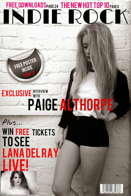
This is my second draft for my front cover, I feel that this is a massive improvement from my original draft. Firstly, I kept the masthead the same due to that being the first thing people look at so I need to make sure it is definitely going to engage them. Secondly, I made a lot of changes but not in what I wrote, but how and where I have put them. For instance, where it says 'free poster inside', is now inside a sticker to separate it from the other texts. I simply found the black sticker on google images and then opened up as a new image, shrunk it down and placed it on the left. The point of the sticker is so it contains significant information for the reader to easily see and read. On the other hand, I also put 'Paige Althorpe' written across her body. This is to let the reader know who she is and what the magazine consists of. I also made a use of the colour red to put emphasis on certain words. When I carried out that questionnaire regarding what to add to the front cover, contents page and double page spread, I had gotten feedback back saying if I was to use a certain colour for more emphasis on specific words or text, make it red. Red is a very alerting colour and connotes a variety of different feelings. Unlike in my first draft when I used blue, blue is a very calm and relaxing colour which would not make my target audience feel very alerted and notified by the front cover. However, I have only written certain words in red for example when it says 'win free tickets to see Lana Del Ray live' I put 'free', 'Lana Del Ray' and 'live' in a red font to highlight important words. Another example of the use of colour is the pink text at the top above the masthead. I decided to use hot pink as it separates it from the significant parts of text on the main image below the masthead. However, the use of pink quickly draws the readers attention to the 'new hot top 10' and 'free downloads', whether or not my target audience are interested, it is there; hard to miss and easy to read. lastly, I have again taken the target audiences advice and have added another image to liven up my front cover. They advised me to add more images to my front cover to make it more engaging and less boring.
Questionnaire:
I also made a questionnaire for my second draft in order to find out what I need to improve on and what I should keep the same. I asked two simple questions; what's good about it? and how should I improve? I also asked three people from my target market of all ages ranging from 16-40 in order to get different feedback from people different ages. As I will be making my final draft next for my front cover, I want to make sure the style and look is fulfilling my target audiences needs.
Nathalie:
1. What do you like about it? I like how it's set out, it is definitely an improvement from the first draft, also the extra image allows more
2. What would you improve/change? Maybe add something under the title as it seems to be a bit bare in that area. Unless you move the sticker up a bit.
Leanne:
1. What do you like about it? I like the way you have overlapped the image with important text, it really engages me, especially the use of the red font.
2. What would you improve/change? I would change the size of the text above the title as to me it takes away the focus of the title itself.
Lorraine:
1. What do you like about it? I like the way it is all set out and the choice of colour and size of font on specific words makes it look really professional.
2. What would you improve/change? However, I would also make the writing above the title smaller because at the moment it is taking all the attention off the title, and the title is important as it tells you what genre of music it is about.

No comments:
Post a Comment