Friday 6 December 2013

Inspiration for Magazine Article


These magazine articles are very different but have unusual features that attract the readers attention. For example, on the first article, the masthead is in a white, big and bold font which makes it contrast with the background to therefore help it stand out to the reader. On the other hand, the images are what stands out the most on the other article which is not a bad thing as it also attracts the readers attention. The first article come across very gothy as if it belongs to a rock magazine, however, I like the layout as I feel that the mid shot and masthead font really portrays the music genre well. Although, I also like the layout of the other magazine article and the use of colour, and how the main full shot image is in colour yet the other smaller images are in black and white. Also the text and the use of a bright blue font on certain words to emphasise and portray what the article is about. I will take into consideration the different features on each of the magazine articles and the diferent layouts.


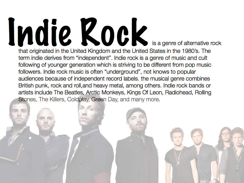
I created a magazine article based on Coldplay who are a well known band. I feel that my magazine article is plain yet effective, because, firstly, I have used the same font for the masthead as I have for the masthead on the front cover which keep the consistency throughout and creates a housestyle. Also, the full shot image which I have chosen fills half of the double page spread which therefore gains a lot of attention from the reader and makes them want to discover what the article is about. I have also used colour within the text, I put the quotation in a green font to make it stand out from all the rest of the text, then, the reader will want to read more about the article. I created  this double page spread on pixlr, an online photo editing website, and due to good outcome I wish to use pixlr for my final product to maintain a professional look.

Audience Feedback...

I made a questionnaire to ask questions on my attempt of a double page spread article. The feedback I got from my audience I will then take into consideration and use it to improve and focus on certain elements of my double page spread article, these improvements will help for my final draft of my article once my photos have been taken of a model. 


Paige Althorpe;

1. Does it catch your eye?
Yes, the image which covers half of the double page spread draws a lot of attention and really helps me feel engaged within the article.

2. If so, what stood out and what didn't?
The image and the choice of size and colour of the font on certain text, for instance the quotation is in a green font which helps it stand out to the reader.  however, it also benefits the presentation of the magazine article as in other magazines this is a common appearance for there to be a quote from the article written in a contrasting colour to engage the reader.

3. Is the subject clear?
It's very clear that the article is about Coldplay as the big, bold font for the masthead is at the top which attracts the reader straight away without doubt.


Looking at my audiences feedback I can take into consideration and focus on certain parts of the magazine article and improve to produce the best magazine article I can. 

Thursday 5 December 2013

Inspiration For Front Cover


These music magazine front covers inspire me in order to create my final piece as good as these with similar features. Q music magazine cover most genres of music including indie rock, for instance when they have Florence on the front cover. I prefer how the Q magazine has lots of features on it which makes it look very busy therefore creating multiple things for the reader to look at. However, on the other hand, I also like how the 'indie' music magazine created a very vintage look. I also like how the font which 'may I shoot you?' is written in is in a handwriting font which makes the magazine look very personal which also links to the music genre as indie rock music is a very independant style of music. Although, I dislike how the masthead does not contast with the background and instead blends in, this does not make the mashead stand out in order to gain the readers attention. Therefore I will combine the different features from both music magazines to fullfill the readers satisfaction, by having the very vintage and retro look but by also having many features such as a bold masthead, sell lines, images and many more to create the right indie rock music magazine that will be best suited for my target audience.


I had a go at creating an indie rock music magazine using a well known artists such as Lana Del Ray. The image is almost a full length shot just cutting off her feet. Lana Del Ray is a big artist and has had many releases. She is also an artist everyone will recognise as soon as they look at the front cover. I have got the image overlapping the masthead which draws more attention to the image therefore, catching the readers eye. I have also used smaller images to go with the short snippets of information on the front cover. These will help draw the readers attention to that certain part of the front cover which would then make them want to read more about the article. I have also used different sized fonts. The bigger the font the more attention that certain section of information is going to get. For example "The New Top 10" is in a big font which engages the reader, therefore, they will read further. The masthead is also in a big, bold, sans serif font at the top, this is there as it will be one of the first things the reader looks a. I have also used colours that contrast with the background, so white's and pinks against the dull background to make it stand out.
I also created this music magazine front cover on pixlr, an online photo editing software. I started of with a plain, almost full length photo of Lana Del Ray with lots of free space around her to add short snippets and the masthead. I added the masthead in a sans serif, white font that contrasts with the background to make it stand out more. I also used a tool on pixlr to make the image of Lana Del Ray to overlap the masthead, so it therefore, draws ore attention to the main image of Lana Del Ray. Lastly, I added the short snippets of information and images round the sides of the main image to finish my front cover.

Audience Feedback

Since this is just an idea of what my actual music magazine front cover will look like, I thought I would make a questionnaire to help me get an idea of the different sections I need to focus and improve on to succeed in fullfilling my target audiences needs.

Paige Althorpe (aged 16):

1. What genre would you say this music magazine is?
Indie rock

2. What do you like about it?
How the titles and headings are different colours to almost make the more important ones stand out the most.

3. What would you change about it?
Perhaps have a heading on the other side to separate them more.


Nathalie Wright (aged 16):

1. What genre would you say this music magazine is?
Indie rock

2. What do you like about it?
How the main image overlapps the title so it then draws more attention to the artist featured on the front.

3. What would you change about it?
Maybe use brighter, more in your face colours to make the small snippets of information stand out and catch the readers eye more.

 
Leanne Payne (aged 18):

1. What genre would you say this music magazine is?
Indie Rock

2. What do you like about it?
I like how it's all set out and the way the more alluring snippets of information are in a bright red or pink professional looking sans serif font. I also like how the main image overlaps the masthead as it really engages the reader.

3. What would you change about it?
Nothing.

 Overall, once I have taken my final photos, I will proceed to make my music magazine front cover including the feedback I have gotten from my target audience to fullfill my target audience's needs.

Sunday 1 December 2013

Inspiration For Music Magazine Front Cover Image


This is inspiration for my magazine front cover image. I want my magazine front cover to look very retro but professional. As my music genre is indie rock, it needs an individual style to it to make it stand out from the obvious pop, hip hop or rock. I will take these images into consideration when thinking about my destination where I will take my photo's for my front cover.

Active vs. Passive Audience Theory

An active audience is one that actively engages with the text, they do not simply accept every media message. They question what they see and are influenced by such things as family background, beliefs, values, culture, interests, experiences and education. 
However, a passive audience does not actively engage with a media text. A passive audience is one that does not question the message that the media is sending and simply accepts the message in the way the media outlet intended. 
I would prefer my target audience to be active as they would be actively engaged and has their own individual view on the media texts and are influenced by cultures, interests, education or experiences... etc. However, I would like my target audience to be passive so they're not actively engaged with a media text and does not have question the media and simply accept it.

The Hypodermic needle or Bullet theory was developed in the 1930’s by researchers interested in explaining the effects of mass media consumption and propaganda in World War 1. The Nazi parties believed the media was highly influential, and so as one of their most effective methods of gaining support, seemingly converted a whole population to supporting Hitler’s rule through the use of Radio broadcasts. The theory claims that audiences are passive and homogenous – that is, each consumer wholly accepts the messages presented by the media in their intended form; each message presented by the media is blindly accepted regardless of individual differences. It is a closed text communication theory, suggesting that messages flow in a linear fashion from the sender to the receiver, with no interference. A limitation of this theory however, is that it suggests no person possesses differences in opinion at all. There is no room for subjective interpretation and it could be argued that if this theory were correct, society would be a group of people with exactly the same beliefs, whereas it is obvious that subjective interpretations exist.


In contrast to the Bullet/Hypodermic Needle Theory, the uses and Gratification theory assumes audience members are active. Developed in the 1940’s by Paul Lazarfeld, in response to growing criticism of the two-dimensional nature of the Bullet theory, claims that texts are open (to interpretation) and that consumers have power over the media, rather than the media having power over them. This 'bottom up' theory suggests that people are responsible for picking and choosing which media content they consume, and if/in which way they may be influenced by it. Just as the name suggests, each person has the power to decide which media texts they will consume for their own self ‘gratification’ or satisfaction. An example of this is how many television programs are axed even after only a few screenings of episodes, if the ratings or circulation statistics are low. Therefore, society is in control of the media they consume. Audience members may stop consuming particular media texts by simply switching the television off etc. However, the flaw of this theory is that it assumes the media has little to no influence whatsoever on the individual.

Different readings;

  • Preferred reading/dominant reading where it is the 'intended' reading of the text.
  • Oppositional reading where you dislike or disagree with the preferred reading.
  • Negotiated reading where you dislike and like different aspects.
  • Aberrant reading where you don't understand/misinterpret.
Therefore, when view the media you fall into one of these reading categories depending on your views and opinions on it. 

Mass Media

Mass Media is where some people are 'opinion leaders' who influence others.

This is a two step flow diagram to show how mass media works;


The two step diagram shows that an opinion on something or someone starts off made from the 'opinion leader' which then spreads to an individual who is in social contact with the opinion leader. In my opinion I feel that people should not follow others and that everyone should have their own opinion on something or someone. On the other hand, you shouldn't follow the crowd to fit in, you aren't going to be an individual if you don't have your own opinions and thoughts on life, in other words, you can't rely on someone else's. 

Another example of this is Social Media which is also influenced by the two step flow. In the past, the opinion leader would have been in your situated culture, so someone you are in direct contact with. Nowadays, through blogs, twitter, Facebook etc, it might be someone in your mediated culture, so someone you 'know' through the media. In other words if you see your role model, Beyonce, Kendall Jenner or any other celebrity tweet or publish something through the media, then you all of a sudden believe and agree with them and spread it. Fair enough if you're a big fan of someone famous and you agree with what they have to say, I still feel that everyone should opinionative within themselves and not influenced by others.

Saturday 30 November 2013

Media Institutions

Magazine Publishers

Magazines are produced by institutions which are companies that produce, market and distribute texts. The two main music magazine publishers in the UK are Bauer and IPC Media


Bauer Media Group is a multinational media company headquartered in Hamburg in Germany. Since the company was founded in 1875, it has been managed by four generations of the Bauer family. Originally a small printing house, The Bauer Publishing Group has grown into a worldwide publishing and media company. The Bauer Publishing Group comprises 300 magazines worldwide in 15 countries, as well as TV and radio stations. Bauer started in the UK with the launch of Bella magazine in 1987 and as H Bauer Publishing became Britain's third largest publisher, Bauer further expanded in the UK with the purchases of Emap Consumer media and Emap Radio in 2008 to then become the UK's biggest publishing group. Bauer media brands include; Kerrang! a rock music magazine which originally began as a magazine then later in 2004 Kerrang radio was launched. Also, Q was first published in 1986, setting itself apart from much of the other music press with monthly production and higher standards of photography and printing, with an emphasis on style. Lastly Mojo


IPC Media which stands for International Publishing Corporation Media was founded in 1958. IPC Media publishes music magazines such as NME a weekly pop/rock music magazine published in March 1952, also, Uncut, a monthly magazine that mainly focusses on music, but also includes film and books sections.


Independent Publishing Alternatives

If a magazine is likely to have a narrow, specialist appeal it may be published by an independent publisher.
Although the sales might be lower, the magazine producer can also focus on an area that would not be covered by major publishers.


Shindig! is an example of a independent publishing alternative. Not only does Shindig! focus on music, it covers art, fashion, architecture, film and TV. According to the latest survey, 82% of Shindig! readers are in the ABC1 category which shows it has a wide range of different people buying it, however, men make up 83% of the readership where women take up 17%.

Fonts


I have been looking at different fonts for my magazine front cover. I want my music magazine front cover to look very vintage and retro, and I think these fonts will make my front cover stand. I need a font that is eye catching but not too much to take away the focus off the other features which also appear on the front cover. After some consideration, I have chosen the 'limelight' font as it is very plain yet does not create a distraction from the rest of the features on the front cover. 

The name of my music magazine is going to be 'Indie Rock', simple but effective as it clearly shows and tells the reader straight away the genre of my music magazine. Out of the twelve fonts I narrowed it down to, I wanted to see what they would look like at the masthead of my magazine, so I wrote 'Indie Rock' in all of the twelve different fonts to then decide which one looked more effective.


After further looking at the different fonts, I decided that the big, bold fonts such as the 'Lemiesz' and 'Troglodyte Nf' fonts, come across too gothy and in your face. Also that it would take the focus off the main image and other features on the magazine front cover. 

Keeping in mind that I want my magazine to look vintage and retro I decided that the 'Limelight' font did this for me. It is very plain and simple but it also catches the readers eye.On the other hand, it will stand out and it also won't take the focus off the other features. I wish to have the main image to overlap the masthead slightly to then draw attention to the main image and then further snippets of information on the front cover, this would be to then make the viewer want to buy it and read it.

Male Gaze

What is the Gaze?

The concept of gaze is one that deals with how an audience views the people presented. 
For feminists it can be thought of in 3 ways:

  • How men look at women
  • How women look at themselves
  • How women look at other women
The male gaze is so pervasive in advertising that it is assumed or taken for granted. Females are shown offering up their femininity for the pleasure of an absent male spectator. 

Gaze and feminist theory

Laura Mulvey coined the term 'Male Gaze' in 1975. She believes that in media, the audience have to 'view' characters from the perspective of a male. The male gaze occurs when the camera puts the audience into the prospective of a heterosexual man. For instance, it may linger over the curves of a woman's body. Laura Mulvey's essay also states that the female gaze is the same as the male gaze. This means that women look at themselves through the eyes of men. For example, if a celebrity or model has a good, healthy body and they show it off then females may look at it as a role model, inspiration or jealousy. However, if a women has a  It's almost as if a women desires to be beautiful which is only satisfied or appreciated by a man. 

Saturday 2 November 2013

David Carson

David Carson is an American graphic designer, art director and surfer. He is best known for his innovative magazine design, and use of experimental typography. David Carson was born on September 8th in 1954 in Texas. He graduated from San Diego State University with a Bachelor of Arts in sociology. David Carson's first contact with graphic design was in 1980, and in 1983 David Carson started to experiment with graphic design and found himself immersed in the artistic and bohemian culture of Southern California. That year, he went to Switzerland to attend a three-week workshop in graphic design as part of his degree. The teacher of the workshop, Hans-Rudolf Lutz, became his first great influence. 


David Carson was hired by publisher Marvin Scott Jarrett to design Ray Gun, an alternative music and lifestyle magazine that debuted in 1992. Ray Gun made David Carson well known and attracted new admirers to his work. In this period, he was featured in publications such as The New York Times (May 1994) and Newsweek (1996).


Ray Gun was an American alternative rock and roll magazine. What David carson did in Ray Gun magazine was to experiment different typographic designs in the magazine. the result was usually a chaotic, abstract style and not always very legible style, but it was definitely distinctive in appearance, which is vey important for a magazine. Ray Gun produced over 70 issues from 1992 to 2000. The content of the Ray Gun magazine was also innovative. The subject matter in Ray Gun was cutting-edge advertising, musical artists and pop culture icons. Ray Gun was in front of it's competitors by putting artists like Radiohead, Eminem, Bjork on it's front cover. Even though since 2000 we can't see the magazine on the shelves, David Carson's influential graphic design work and so called "grunge typography" are widely-imitated aesthetics today.


Music Genre's

Music Genre's


Technology

Thursday 24 October 2013

Ideology

An ideology is a belief. Every musical genre has an accompanying ideology, often genres divide along binary oppositons or a dichotomy. For example, the two music genres Pop and Rock both have a different ideology. Pop is quite happy and calm whereas rock is the complete opposite, aggresive and loud. The ideology of the genre affects all aspects of it's representation. Music magazine's will reflect the ideology of their genre in visual style and language.


The ideology of the "Top of the Pops magazine":

  • Girly
  • Bright colours
  • Pop music artists
  • Pinks
  • Beauty products
  • Justin Bieber
  • Friendly
  • Clean
  • Young audience
  • Pop music
  • Happy/smiling on the front cover


The ideology of the magazine "Kerrang!":
  • Blacks
  • Dull
  • Not happy/no smiling on front cover
  • Rock music
  • Older audience
  • Paramore
"Top of the Pops" is a typical pop music magazine in comparison to "Kerrang!" which is a rock magazine. "Top of the Pops" is very girly and uses a lot of bright colours and pinks which have various connotations such as purity, femininity, an friendly, whereas, "Kerrang!" connate different meanings, for example, "Kerrang!" is more masculine, authentic, sexist, loud and aggressive. Although both magazines are very different and almost complete opposites, they both stand out to the audience and have different features that catch the readers eye.


Monday 21 October 2013

Mood board


This is an inspirational mood board I created of the music genre indie rock. I have incorporated different indie rock bands such as; Mumford & Sons, The Rolling Stones, Coldplay. But there are many more indie rock bands, for example, Radiohead, Oasis, The Beatles, Green Day and Kings of Leon. I have also included different fonts, most of them tend to be a big, bold, clear sans serif font, which maybe implies that that particular font catches the readers eye, I will keep this in mind when creating my own music magazine as using a similar font may benefit my magazine. Creating this mood board has given me a whole range of different ideas for my future music magazine.

Sunday 20 October 2013

History Of Music Magazines

Q


Brief history of the magazine

Q was founded by Mark Ellen and David Hepworth and it was first published in October 1986. Q was originally called Cue, but the name was changed so that it wouldn't be mistaken for a snooker magazine. Q is the UK's No. 1 actively-purchased music magazine. It is also now written and edited by Matt Mason. It's a monthly magazine that celebrates everything that's great in rock and roll. Since Q was launched in 1986 it has built an international reputation for quality amongst fans, stars and the music industry. Q has featured some of the world's biggest artists, such as, Adele, Rihanna, Radiohead, Oasis, Lady Gaga, Coldplay, Kings Of Leon, Lilly Allen and many more. 


What is the typical content?

In Q magazine the contents usually includes an extensive review section, new releases and concert reviews. However, most of the magazine concentrates on interviews with modern music artists. Although the magazine is very popular for the lists it makes, it has created many, ranging from 'The 100 Greatest albums' to the '100 Greatest songs of all time'. Every issue of Q has a different message on the spine, this keeps readers interested as they try and work out what the message has to do with the contents of the magazine. Lastly, often promotional gifts are given away, such as cover-mounted CDs or books.

Who is the typical reader?

31.7% of the Q readers are female when the other 68.3% are male, this doesn't surprise me because I feel that men are more into a more varied music  genre whereas woman prefer up to date, more feminine magazines. Statistics also show that younger people tend to read Q more than older people do. To show this; 35.5% people read Q aged 15-24, however, 1,4% of people read it aged 65+. Also, 70% of the reader are ABC1 profile which shows that most of the reader are higher class.
What I found interesting about the typical readers of Q magazine was that more young people read it. I personally thought that because of the rock and roll music genre, that the readers would be mainly aged between 35 and 54.

Chosen magazines' house style

Firstly, in the house style of Q magazine each issue published has the same masthead, this is to create a consistency throughout the magazine so it will therefore, make it easier for viewers to recognise which magazine they are purchasing. The masthead is always in the top left of the magazine and sometimes it is overlapped by the main image, this interests the reader to be tempted by the artist on the front cover. Also, the colour of the masthead is always red background with a white font. This is to keep a consistency throughout so it will help the readers recognise the magazine.

Producing and distributing of Q magazine

Q was distributed by Gareth Viggers and it was produced by John refolds who was even nominated for Q magazine producer of the year.

How are social groups represented in your magazine?

In Q magazine it is aimed at a more mature audience so the readers won't try so hard to look like the people in the magazine.


KERRANG!

Brief history of the magazine

Kerrang! commenced publication on 6th June in 1981 and was edited by Geoff Barton, initially as a one-time supplement in the Sounds newspaper. Launched as a monthly magazine, Kerrang! began to appear on a fortnightly basis later, and in 1987 it went weekly. Angus Young of AC/DC appeared on Kerrang!'s first cover. Kerrang! magazine is now the worlds largest weekly music magazine which is written and edited by James McMahon. 


What is the typical content?

Kerrang! includes full page advertisements for music companies such as HMV and Play.com as well as promoting other retailers such as Virgin, Playstation, xBox, alternative clothing and jewellery manufacturing and concert ticket lines. Pages of letter, drawings and photos, reader's polls, gig reviews, editorial team recommended entertainment, competitions and the Kerrang! diary of upcoming gigs all give the readers a chance to respond and share their views and opinions.

Who is the typical reader?

Kerrang! aims itself more at a male audience and appeals to them by using content such as hard rock and metal iconic male bands on the front cover pulling angry faces or violent expressions. Devoted audience of rock fans is made up of 60% males and 40% females with Kerrang!’s demographic fall into social class D-C. . It is evident that the magazine is aimed at a young audience, through the use of graphics, fonts, layouts and presentation.Kerrang! is aimed at the youth and their lifestyles. It has a contemporary and up-to-date look, making use of modern typefaces and a down-to-earth feel. 

Chosen magazines' house style

The masthead on Kerrang! is not always in the same colour but is always in the same sans serif font. The masthead is always featured at the top of the front cover with an effect on it that makes it look smashed up, this gives the reader a clear idea of what music genre the magazine is. The masthead is always very similar on each issue so the reader recognises the the magazine in the future. The main image on the front cover sometimes overlaps the masthead which draws the viewers attention to the artist who may have a link to one of the main articles inside.

Producing and distributing of Kerrang! magazine

Kerrang! magazine is produced and distributed by the Bauer media group Bauer have also invested in Seymour which is an international distributing company allowing Kerrang! to be distributed across the world.  


How are social groups represented in your magazine?

In Kerrang! it is aimed at a male and female teenagers around the age of 14 to 25 who are interested in alternative and rock music.

Denotation and Connotation

Denotation' tends to be described as the definitional, 'literal', 'obvious' or 'commonsense' meaning of a sign. Whereas the term 'connotation' is used to refer to the social and cultural factors and 'personal' associations (ideological, emotional etc.) of the sign.

So denotation being the thing itself and connotation being the meanings we describe to that thing, some examples are;

Denotation;
- Blonde hair
Connotation;
- 'Dumb blonde, jealousy...

Denotation;
- House, home, residence all mean the same thing but all have different connotations...
Connotation;
- Home: cozy, loving, comfortable
- House: the actual building or structure
- Residence: cold, no feeling
            

Textual Analysis Of Existing Texts

This was originally a slideshow on keynote on the macs, but due to errors getting it on to my blog I had to export it to images. I have looked at two magazines, one being Q and the other NME. I have looked at the front cover, the contents page and a double page spread for both of the magazines.


Thursday 17 October 2013

The Four F's Of Magazine Design

The four F's are:
  • Format - visual style
  • Formula - what is in the magazine and where it is
  • Frame - the margins and gutter
  • Function - what is it's job? sum up in a sentence, sell line, or slogan...
These will help me when it comes to producing my music magazine as I can then think about the four F's to help me produce the best magazine I can. If i'm thinking of more than just the visual style like, for example, I will be looking at the job is of it which will help me come up with a sell line which will then, therefore, help my music magazine sell well.

Print Terminology


Print terminology are things such as;

  • Primary
  • secondary
  • Quantitative
  • Qualitative 
  • Serif
  • Sans serif
  • Lower case
  • Upper case
  • Sell lines
  • Masthead
  • House style
  • Mid shot
  • Long shot
  • Close up
  • Wide shot
  • Extreme close up
This terms will help with the presentation of my music magazine by making it look very sophisticated and professional.


  • Bleed is a printing term that refers to printing that goes beyond the edge of the sheet before trimming. So, the bleed is the area to be trimmed off. After trimming, the bleed ensures that no unprinted edges occur in the final trimmed product. Bleed will help me with producing my music magazine to make sure there are no errors of printing at the sides.
On this picture the part labelled '2' is a safe zone outside the trim area (bleed).


  • Strap line is a short catchy sentence that represents a business, project or concept. It is a way of expressing something of what you do: what benefits you give your customers, or what you stand for. This would benefit my music magazine as it would help persuade the customer to buy it.
  • Pass audience is when one member of the household buys a magazine but another member of the family in that household reads it. Whether they are your target market or not, it adds to the number of people who have read that magazine
  • Pug is where the corner of the page is covered and usually has a buzzword (promotes something that is exclusive or for example where a magazine has a prize to win it will usually say the word "WIN" to promote something the reader can get for free) inside of it. It is an incentive to open the magazine. Also, it can be short snippets of information on the front of the magazine next to the title which will draw the customers attention, so, therefore, it will benefit my magazine a lot. 
  • Tagline is the word of phrase used to engage a readers interest in a story by categorising it, for example, 'exclusive', 'sensational'. This will help me when I come to make my magazine cover I want to interest the reader as much as I can and by engaging them by using tagline it will help me a lot when selling the magazine.
  • M.I.R.A is a way to approach analysis of media text;
M - Media form: What is this? 
For example, a music video, movie,TV series, magazine, poster...

I - Institution: Who made this?

R - Representation: Who or what does this show?
For example, is the representation positive or negative? Is it a stereotype or is it original?

A - Audience: Who is this for?

M.I.R.A will help me with my magazine as when my audience ask questions I will know the important things about the magazine, for example, who made it and what it is and what it shows...

  • Gutter is a vertical margin of white space where two pages meet, it allows for bindings in the magazine. This will make my magazine look more professional and also neater and perhaps easier for the reader to read as the text in the middle will not be lost.
  • Allies are what separates the columns in a text. it will space out the writing making it easier for the reader to read which will make my magazine look neater yet more professional.

Thursday 10 October 2013

Research Methods


I will be using different research methods for my AS Media such as:


  • Primary research
Primary research is research I will carry out myself. For example; interviews, questionnaires, surveys, textual analysis or even the internet. Advantages of using primary research are that the researcher can focus on both quantitative and qualitative issues, the researcher has control over how the information is collected and controls the search design to fit their needs. However, disadvantages of primary are that it may be very expensive carrying out research compared to secondary research as for things like questionnaires it will cost for all of the paper used and for any equipment needed for any other experiments.

  • Secondary research
Secondary research is research that I use that someone else has carried out, so you're looking at existing research rather than primary research where you collect the research yourself. For example; search engine, websites, books, magazines or journals. Advantages of secondary research are things like the ease of access to many sources of secondary data and low cost. However, the disadvantages are that it may not be specific to researchers needs, the researcher may not get the full version of the research to gain the full value of the study. 

  • Qualitative research 
Qualitative research is research concerned with peoples ideas, opinions, thoughts and feelings. For example interviews, observation, sampling, and questionnaires. Qualitative research is strong for;portraying perspectives and conveying feelings and experiences, the ability to embrace both verbal and non-verbal behaviour, to penetrate fronts, discover meanings and reveal the subtlety and complexity of cases or issues. However, difficulties and weaknesses can be things such as; it can take time to negotiate access, assemble a sample, develop trust and rapport, and find out what is 'going on' or what people are thinking.


  • Quantitative research
Quantitative research is identification of patterns and trends, for example; more woman than men read 'vibe'. Quantitative research can also be things like  surveys and customer questionnaires to help firms improve their products and services. It's about asking people for their opinions in a structured way so that you can produce facts and statistics to guide you. To get reliable statistical results, it's important to survey people in fairly large numbers and to make sure they are a representative sample of your target market. Quantitative research is a good method of research as it can tell you things like; what type of people are your best customers, how many people are interested in buying your product or service, and the needs of your target market. A disadvantage is that a large sample of the population must be studied; the larger the sample of people researched, the more statistically accurate the results will be. 

Contents Page


This is my draft for the contents page. As you can see, I have stuck with the school colour scheme again to make it look plain yet professional and sophisticated. The colours stand out and therefor catch the readers eye, for example the red and black fonts on the white background. Also, I have kept the same font as I have for the masthead on my front cover so it looks simple and not messy with loads of different fonts. The masthead is also a sans serif font to make it look more formal. I am going to use images on the contents page to attract the readers attention and make them want to go to that page, whereas, if there was not any photo the magazine might come across boring and plain.


This is my final contents page where I have changed a few things but still kept it simple yet effective. I have included the school logo where it uses the rule of three; challenge | Commitment | choice, which fits in with the overall theme of the magazine. I have also used post it notes to put the text in so it makes it more like a school magazine as it's school equipment, but it still look sophisticated and professional. I have included two images, one being the Ecuador team and the other showing the new school system. The use of images my attract the younger audience, so therefore, I will  my magazine will have larger amount of buyers and readers. 


School Magazine Front Cover


This was the original photo that I took before I edited it. It's a mid shot of a year 9 student taken outside the main entrance of the school. The photo is also taken next to the school's new system where members of the staff and students swipe their card to easily and quickly sign in and out of school. One of the main bits of information I was going to include in the magazine as well as a short snippet of it on the front cover is the 'new school improvements'. So, therefore, this mid shot would be a good choice for my front cover.


This is the photo after I edited it. As you can see, I coloured in the background white to make it look more plain yet professional. I also put the masthead at the top in a big, serif font to make it look more sophisticated and to make it the first thing the reader looks at because it stands out the most. I also added shorts snippets of the 'New School Improvements' and 'exam results' to catch the readers eye and to make them want to read more about it. I have also stuck to the school colour theme; red, white and black, this make the front cover look more professional and it makes the information stand out in some cases, for example, the red and black fonts stand out on the white background and makes it easier to read.