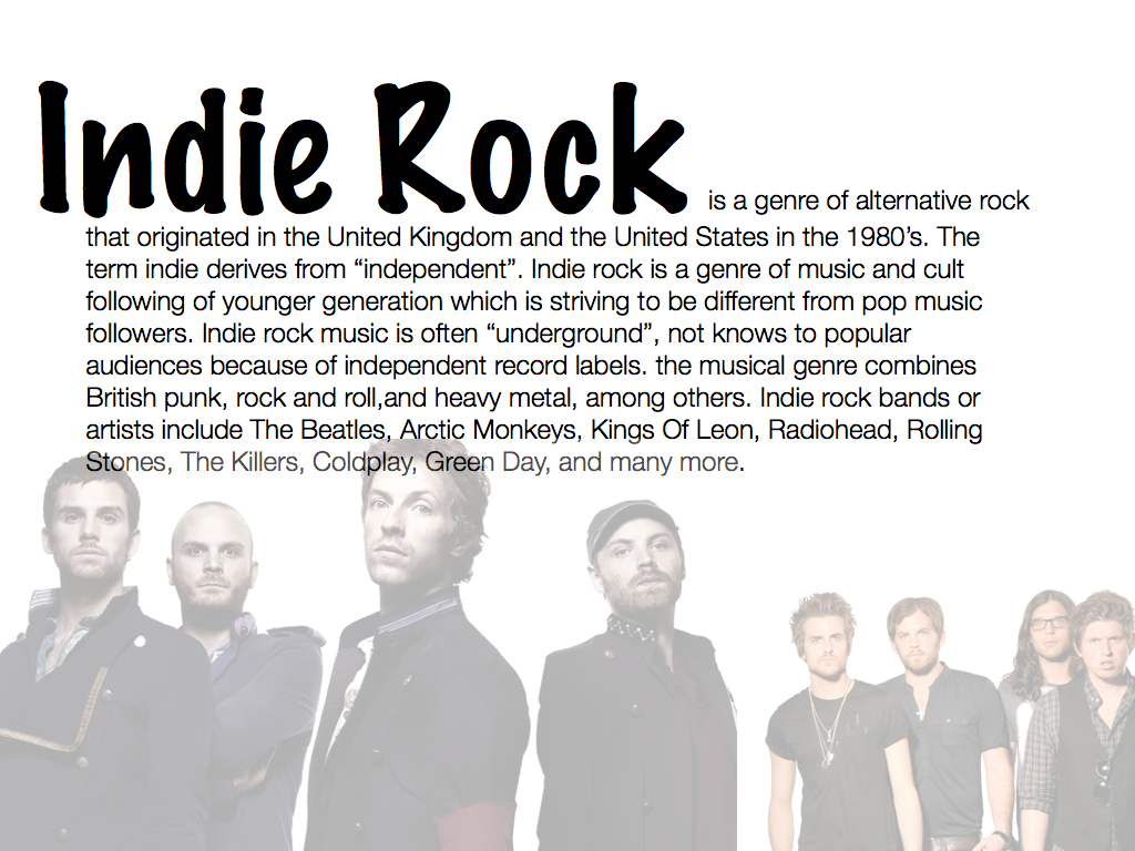
Saturday 30 November 2013

Media Institutions

Magazine Publishers

Magazines are produced by institutions which are companies that produce, market and distribute texts. The two main music magazine publishers in the UK are Bauer and IPC Media


Bauer Media Group is a multinational media company headquartered in Hamburg in Germany. Since the company was founded in 1875, it has been managed by four generations of the Bauer family. Originally a small printing house, The Bauer Publishing Group has grown into a worldwide publishing and media company. The Bauer Publishing Group comprises 300 magazines worldwide in 15 countries, as well as TV and radio stations. Bauer started in the UK with the launch of Bella magazine in 1987 and as H Bauer Publishing became Britain's third largest publisher, Bauer further expanded in the UK with the purchases of Emap Consumer media and Emap Radio in 2008 to then become the UK's biggest publishing group. Bauer media brands include; Kerrang! a rock music magazine which originally began as a magazine then later in 2004 Kerrang radio was launched. Also, Q was first published in 1986, setting itself apart from much of the other music press with monthly production and higher standards of photography and printing, with an emphasis on style. Lastly Mojo


IPC Media which stands for International Publishing Corporation Media was founded in 1958. IPC Media publishes music magazines such as NME a weekly pop/rock music magazine published in March 1952, also, Uncut, a monthly magazine that mainly focusses on music, but also includes film and books sections.


Independent Publishing Alternatives

If a magazine is likely to have a narrow, specialist appeal it may be published by an independent publisher.
Although the sales might be lower, the magazine producer can also focus on an area that would not be covered by major publishers.


Shindig! is an example of a independent publishing alternative. Not only does Shindig! focus on music, it covers art, fashion, architecture, film and TV. According to the latest survey, 82% of Shindig! readers are in the ABC1 category which shows it has a wide range of different people buying it, however, men make up 83% of the readership where women take up 17%.

Fonts


I have been looking at different fonts for my magazine front cover. I want my music magazine front cover to look very vintage and retro, and I think these fonts will make my front cover stand. I need a font that is eye catching but not too much to take away the focus off the other features which also appear on the front cover. After some consideration, I have chosen the 'limelight' font as it is very plain yet does not create a distraction from the rest of the features on the front cover. 

The name of my music magazine is going to be 'Indie Rock', simple but effective as it clearly shows and tells the reader straight away the genre of my music magazine. Out of the twelve fonts I narrowed it down to, I wanted to see what they would look like at the masthead of my magazine, so I wrote 'Indie Rock' in all of the twelve different fonts to then decide which one looked more effective.


After further looking at the different fonts, I decided that the big, bold fonts such as the 'Lemiesz' and 'Troglodyte Nf' fonts, come across too gothy and in your face. Also that it would take the focus off the main image and other features on the magazine front cover. 

Keeping in mind that I want my magazine to look vintage and retro I decided that the 'Limelight' font did this for me. It is very plain and simple but it also catches the readers eye.On the other hand, it will stand out and it also won't take the focus off the other features. I wish to have the main image to overlap the masthead slightly to then draw attention to the main image and then further snippets of information on the front cover, this would be to then make the viewer want to buy it and read it.

Male Gaze

What is the Gaze?

The concept of gaze is one that deals with how an audience views the people presented. 
For feminists it can be thought of in 3 ways:

  • How men look at women
  • How women look at themselves
  • How women look at other women
The male gaze is so pervasive in advertising that it is assumed or taken for granted. Females are shown offering up their femininity for the pleasure of an absent male spectator. 

Gaze and feminist theory

Laura Mulvey coined the term 'Male Gaze' in 1975. She believes that in media, the audience have to 'view' characters from the perspective of a male. The male gaze occurs when the camera puts the audience into the prospective of a heterosexual man. For instance, it may linger over the curves of a woman's body. Laura Mulvey's essay also states that the female gaze is the same as the male gaze. This means that women look at themselves through the eyes of men. For example, if a celebrity or model has a good, healthy body and they show it off then females may look at it as a role model, inspiration or jealousy. However, if a women has a  It's almost as if a women desires to be beautiful which is only satisfied or appreciated by a man. 

Saturday 2 November 2013

David Carson

David Carson is an American graphic designer, art director and surfer. He is best known for his innovative magazine design, and use of experimental typography. David Carson was born on September 8th in 1954 in Texas. He graduated from San Diego State University with a Bachelor of Arts in sociology. David Carson's first contact with graphic design was in 1980, and in 1983 David Carson started to experiment with graphic design and found himself immersed in the artistic and bohemian culture of Southern California. That year, he went to Switzerland to attend a three-week workshop in graphic design as part of his degree. The teacher of the workshop, Hans-Rudolf Lutz, became his first great influence. 


David Carson was hired by publisher Marvin Scott Jarrett to design Ray Gun, an alternative music and lifestyle magazine that debuted in 1992. Ray Gun made David Carson well known and attracted new admirers to his work. In this period, he was featured in publications such as The New York Times (May 1994) and Newsweek (1996).


Ray Gun was an American alternative rock and roll magazine. What David carson did in Ray Gun magazine was to experiment different typographic designs in the magazine. the result was usually a chaotic, abstract style and not always very legible style, but it was definitely distinctive in appearance, which is vey important for a magazine. Ray Gun produced over 70 issues from 1992 to 2000. The content of the Ray Gun magazine was also innovative. The subject matter in Ray Gun was cutting-edge advertising, musical artists and pop culture icons. Ray Gun was in front of it's competitors by putting artists like Radiohead, Eminem, Bjork on it's front cover. Even though since 2000 we can't see the magazine on the shelves, David Carson's influential graphic design work and so called "grunge typography" are widely-imitated aesthetics today.


Music Genre's

Music Genre's


Technology